ICON SEG Redesign
Skip to the case study because you’re yammering, Ciarra.
The year was 2023. I completed my contract and decided journalism wasn’t for me anymore. I had my eye on content design and completed a certification with an internship under my belt. It was tough finding a job as a new UX writer (and it still is), so I took the advice that all established designers give: do the thing. Whether it’s designing flyers for your local pizza shop or, in my case, redesigning a website for one of my connections.
I set two intentions for this project: work to create something they were proud of and create my own experience to talk about in interviews. I’m so proud to have achieved both. It taught me a lot about collaboration, communication, and perseverance. Here we are a year and a half later.
Case study begins here
Goal: To attract more brands for partnerships.
Problem: There wasn’t enough context or content around what ICON was or did with a plain design that put the onus on visitors to find out for themselves. There wasn’t enough information, so they couldn’t find the answers they were looking for. No context about how ICON worked with brands.
Old version of website.
Solution: I researched how companies in the same industry presented their information and met with the founder to become clear on goals and align on brand voice. I redesigned the user journey to start on the homepage, featuring everything: what ICON is, the services they offer, brands they’ve worked with before, their values, and contact information. Each section is an entry point into a new page that has more information.
New version of the website.
Services were updated with accurate offerings. Changed to a carousel instead of a drop-down.


Since the goal is to attract more brands, I put brand endorsements first. There’s a blurb to explain how ICON provides and achieves each service. And when a user hovers over it, they can “view more,” which brings them to the dedicated page. Then, they can hit the “next” or “back” buttons to navigate to the next service page. The button copy is an opportunity to test in the future to see if users know what they’re for.
New services
Values were missing from the original design but having them as a company boosts credibility.
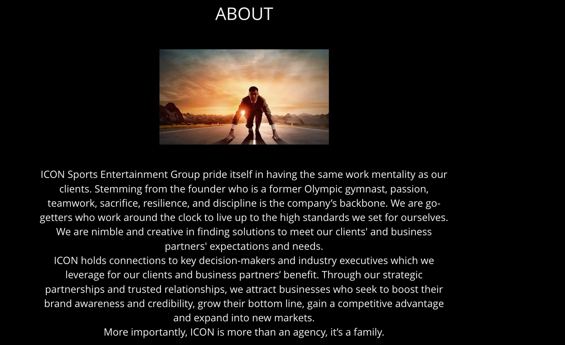
Old about page
As an entry point, I added ICON’S values to the homepage and the CTA button entitled “our story” to lead users to the about page.
New about section
The previous contact page was a form with no other information or call out to contact the company.

Old contact form
The contact section calls out ICON’S desire to partner with more brands, providing three methods to reach out. No form since the preferred method of communication is shown.

New contact
The footer is my personal favorite because it shows personality, so I added a CTA with button copy to “join the fam,” which leads to the founder’s email and social icons.

New footer

Old footer
Results will be continuously updated each quarter to see if there is an increase in brand partnerships and site visitors. I also set up the SEO because it was not set up before. Lots of exciting data to come!