Justworks Mobile Empty States
I collaborated with designers and product managers to redesign the empty states in the Justworks mobile app. The goal was to make the experience concise and informative.
To construct the experience, I researched and asked questions like, “What needs to be communicated?” “Where is the user coming from? Where are they going next?” “Does action need to be taken?”
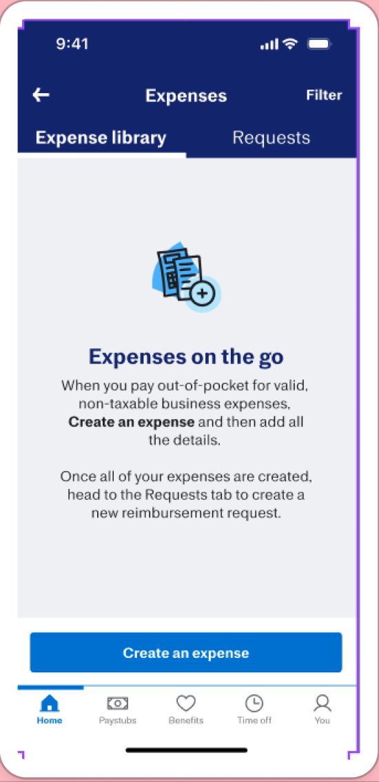
I chose some of my favorite and most impactful screens below. The original is on the left and the final is on the right. The copy for each screen is in the caption.
Goal: To let users know they need to create expenses before requesting reimbursements.
Solution: Led with a question to provide a concise answer. I needed to consult legal for the final copy so I asked “What’s the easiest way to review?” “What words need to stay in?” After Slacking the copy over, the response was, “valid business-related purchase.”
Goal: To notify users that their benefits were not sponsored by Justworks without using too many negatives.
Solution: I asked two questions: “Can the admin really sort it out?” and “Why would a user see this?” This helped my team become clear about what needed to be said and think about the validity of the statement. I found nothing could be done if the company doesn’t use Justworks for their employee benefits. I asked the engineering manager if it was possible to add the company name for personalization, and the answer was yes. :)
Goal: To let people know their benefits couldn’t be viewed in the app.
Solution: I made the headline actionable and condensed the body. Looking at it with fresh eyes, I would’ve specified the Justworks website. I enjoyed finding the best way to communicate this because there were so many possibilities.


